
Sunday, December 01, 2013


Saturday, November 30, 2013
Modelling in Monastiraki
Photographer Michelle Gagné dropped by the shop with model Sandrine
They proceeded to reveal the loveliness all around.

Michelle Gagné Photographer
They proceeded to reveal the loveliness all around.

Michelle Gagné Photographer
Friday, November 15, 2013
INTERVIEW Emma Senft
-->


Is an artist based in Montreal, where she focuses on making
objects and images, and obsessively pickling, preserving and fermenting food. Her
practice focuses around drawing, printmaking, sculpture and installation. In
2011 she received her BFA from the Nova Scotia College of Art and Design
University in Halifax, including a term at the Glasgow School of Art in
Scotland.
Casting will be showing at Monastiraki from 1
November to 1 December, 2013. You can find her website here.
***********************************************************************
On 1 November 2013,
Monastiraki was warm with bodies and voices orbiting the front of the gallery,
interacting with Senft’s work. And it wasn’t the glance-hmmm-nod type of interaction
(that’s altogether too bourgy, and we all know that). The knit-like patterns evoke
a trance of sorts; eyes doing infinite loops while remaining grounded in the
soft, sinewy line work. The pieces are at once taxing and sedative, a quality
of art that creates a rare sense of breathing room for the viewer. Following
the patterns is a commitment, yet pausing is an acceptable and, perhaps,
essential facet. It’s quite clear that Senft won’t be a starving artist (she
pickles). As the night was coming to an end, Senft and I spoke about
untouchable art, pig noses, and people who don’t have secrets.
In your artist
statement, you mention taking your drawing ‘beyond the page.’ Can you talk a
bit more about that?
My dad was a sculptor, so
I grew up in a metal shop. When I did end up going to art school, I didn’t take
any sculpture classes. I still haven’t really acknowledged or found where that
resistance laid. So that led me into other venues – a lot of which was
printmaking. That’s where I really learned paper, surface, line, that kind of
thing. And when I left school, a lot of that translated to drawing, because
that was what was affordable and accessible .and easy Once I start to look
back, I realize that everything I make or have made is this obsession with
surface, materiality, form, line. And all that goes back to, really I think,
love of sculpture, and that being the initial education. So I think that’s
where my desire to take it [my work] ‘beyond drawing,’ comes from. It’s like,
“Yeah, I made this drawing,” and then I’m interested in it, but I want it to be
more. I want to make things that are 3-D or malleable or more physical. And
bigger or touchable.
Which seems to be
embodied by your installation in the window. The changing shadows throughout
the day was a great surprise.
That piece is about the
material but it’s also about the surface it hangs on. Because it casts
multiple-layered shadows, so it’s really about how it interacts with the
surface behind it. I’ve always hung it on a wall and made sure it was lit in an
interesting way. But now it’s hung on a surface that has two sides, so it’s
doubled in that sense where it has that extra layer, which is really exciting.
Tonight, we’ve seen
people touching the installation, adding a third element to the piece. What are
your feelings on viewer interaction; should people touch art?
This is really my dad – I
grew up [with the idea] that you touch art, that’s what you do. If there’s a
sign that says, ‘Don’t touch the art,’ that’s bullshit. Now when it’s a print
or a drawing, I don’t necessarily believe that. You know, if you have clean
hands and you’ve handled paper before and you know what you’re doing – great,
touch it. But it’s hard to let the general public touch a drawing because it’s
going to be destroyed. [The installation in the window is made out of] EPDM,
but it’s like sheet rubber, essentially. It’s pretty durable, and everybody
sees it and they have no idea what it is, and they’re so interested. So I’m
always telling people, “Touch it, here, just feel this, you know? Move it
around.” They’re like, “Really, are you sure?” “Yeah, please, this will give
you an understanding of what you’re looking at,” you know? This explains the
sculpture if you realize what the material is. I’m very for touching sculpture,
touching art.
Also in your artist statement, the word subtle
seems to be a driving force in your work. You express a need for patience when
dealing with your artwork, and enjoying pieces that ask the same of the viewer.
In that same vein, how do you feel about people who don’t have any secrets?
Does that make sense?
I work in service, [at a]
café, and something that I struggle with or come up against a lot is people
just asking questions about your life. As if it’s never occurred to them that
you don’t work in a café because you want to be a public icon, you work there
because it pays you. Right? And, I don’t want to tell this stranger what
neighborhood I live in. People who don’t have secrets is like the same thing to
me, I don’t relate. I like to be social, I like to talk and hang out and meet
people but I also really like to have that separation between private and
public life. [This translates into the art world when,] for some people
abstract work is problematic: “What am I supposed to be seeing here?” Versus
why I’m so drawn to making something that is abstract and that I want people to spend time [with]
and see whatever they want; I think that’s a parallel. What I go through in
making this work – because they’re kind of process-based drawings, they’re
meditative – that’s not necessarily what’s on display. What that drawing is
about for me is not what that drawing is about for that viewer.
When you were young,
was there something you found yourself habitually drawing?
The way that I drew noses
as a kid was pig noses – so the two dots and then a circle around. Any figure
that I drew human, alien, otherwise had a pig nose. Which is really nice. My
dad, being a metal sculptor, he would sometimes take a drawing and turn it into
a sculpture. So there’s this amazing drawing that I did age 3 or 4, and it’s my
cousin crying. It’s kind of like a sun head – it’s a blob. And then there’s
lines coming out of it – hair – and then these eyes that are crying and this
pig nose, and a wide open wailing mouth. And then just two legs, with lots of
toes. So this exists now in forged steel, and it’s amazing – the best
collaboration I’ve ever seen. It’s my cousin being a drama queen at age 5.
Family portraiture.
Is there anything
you’ve been reading or listening to that’s worth putting on record?
Something that I’m really
excited about that just started is Perish Publishing, out of Toronto. I think they’re making art books.
I read this book recently
that I really loved, and I’ve been recommending it to everybody since then but
I think, ultimately, I should just recommend it to young women I know. It’s
called How Should a Person Be? by Sheila
Heti – I think she’s from Toronto, she’s pretty young. I relate to it on this
level of what-the-fuck, and I’m a young artist trying to make it sort of thing.
But I don’t know why or how. But at some point in the book she buys a tape
recorder and approaches her best friend – she’s trying to write a play and
she’s really stuck. She wants to record all the conversations she has with her
best friend who’s a painter. And her best friend flips out, she’s like, “You
can’t put me into this concrete thing where everything I say is now archived
forever, that’s horrifying.” And that’s how I felt when Billy told me we were
going to have this interview, I was like, “Oh no!” So it’s good, I’ve overcome
a fear today.
Interview conducted by Tara Slaughter
Thursday, November 07, 2013
YUM YUM COLLECTIVE & FRIENDS

YUM YUM COLLECTIVE from Belgium
with some Canadian friends make wicked art book
MUD GUM
launched at Monastiraki !
Saturday, October 26, 2013
Emma Senft - Casting November 2013

Cette exposition présente deux séries parallèles commencées au printemps 2011. Débuté comme un processus basé sur le dessin, ce travail explore la fonction, la décoration et la stylisation dans l’art. Ce travail reflète ma curiosité face à la surface, la texture et le matériel et porte le dessin au delà de la ligne et du papier.
Le travail qui m’inspire est souvent subtil, lent et élégant. Il requière patience et temps de la part du public, plutôt que de venir à sa rencontre trop aisément et trop révéler rapidement. Je fais un travail qui est complexe, éveillant la curiosité du public.
-------------------
Emma Senft focuses her art practice around drawing, sculpture and print. She earned her BFA from NSCAD University in 2011, and has exhibited within Canada as well as in the United States and Scotland. Emma currently lives in Montreal, where she is making objects and images, and obsessively pickling, preserving and fermenting food.
This exhibition presents two parallel series started in spring 2012. Begun as process based drawing, the work explores function, decoration and stylization in art. This work reflects my curiosity for surface, texture and material, and an extension of drawing beyond line and paper.
The work that inspires me is often subtle, slow and elegant. It requires patience and time from the viewer, rather than coming forward and giving too much away. I make work that is intricate, sparking curiosity in the viewer.
Thursday, September 26, 2013
♥ The Moved & The Shook ♥ 100 drawings by Sherwin Sullivan Tjia !!

♥ The Moved & The Shook ♥
100 drawings by Sherwin Sullivan Tjia hand-picked from ten years of sketchbooks
Wednesday October 2, 2013 - Sunday, October 27, 2013
Vernissage:
Wednesday, October 2, 2013
6 - 9 PM
♥ ARTIST STATEMENT:
For ten years I carried a sketchbook around in my pocket. It was always the same kind of sketchbook. It was about an inch thick and had the rough dimensions of a postcard. "Opens flat!" the cover sticker boasted. And over ten years I filled thirty of them.
Mostly I filled them with drawings of folks on the bus. I took a bus everyday to my job up the hill and instead of reading or smartphoning I drew my daily companions on that ride.
You really get to know someone when you draw them. You get to like them, even if they look like a mean sort of person. A funny thing that happens when you run your pen along their faces like you're a blind person trying to get a picture of them in your mind. You grow fond of the particularities of a person's features.
One time I was on the street and I see this guy walking by me and I recognize him but don't know how I know him and then I remember I drew him on the bus a couple days ago. For a moment I consider stopping him and showing him the drawing I have of him in my book but then I thankfully come to my senses and don't say anything.
I get really self-conscious when the person beside me starts showing an inordinate interest in my drawing. They often look at my drawing and then look at the person and then back again, to make comparisons between my drawing and real life.
The rise of the smartphone was a great thing for me. It's easier to draw someone if they're sitting still, and their razor-sharp focus on the game they're playing or the facebook they're updating or the text that they're typing helps me out a lot.
One of the things I had to get used to was the movement of the bus. It's like being on a rocking boat. You learn when it's a good time to make a line, and when you have to refrain. Only a few times did the bus suddenly jerk or brake and make me wreck a really good drawing.
I don't want folks to know I'm drawing them. Sometimes they notice and then they get all self-conscious and then I stop drawing at once because who needs that kind of scrutiny? Even though they are in a public space, they have a private look on their faces.
This series of drawings are what I consider the best and loveliest from my ten year's harvest.
♥ ARTIST BIO:
Sherwin Sullivan Tjia is a Montreal-based writer & illustrator who has written 8 books.
The World is a Heartbreaker, a collection of 1600 pseudohaikus, was a finalist for the Quebec Writer’s Federation’s A.M. Klein Poetry Award.
The Hipless Boy, a collection of short, interconnected stories told in graphic novel form, was a finalist for the Doug Wright Award in the Best Emerging Talent category, & also nominated for 4 Ignatz Awards.
His invention, The E-Z-Purr: The Virtual Cat! (an album with over an hour of cats purring) is available on the iTunes music store.
In his spare time, he organizes Slowdance Nights, Love Letter Reading Open Mics, Crowd Karaoke singalongs, & Strip Spelling Bees in and around Montreal & Toronto as Chat Perdu Productions.
**************************
♥ COMMUNIQUÉ DE L’ARTISTE
Pendant plus de dix ans, j’ai rempli trente cahiers de dessins de citadins dans l’autobus.
On apprend vraiment à faire connaissance avec quelqu'un quand on le ou la dessine. Une drôle de chose se produit lorsqu’on trace les contours d’un visage au crayon tel un malvoyant qui tente de se faire une idée du visage de quelqu'un dans son esprit: on se prend à aimer la particularité des traits de ce visage.
La popularité des Smartphones a été une bonne chose pour moi. Il est plus facile de dessiner quelqu’un s’il reste immobile et que son attention est concentrée sur le jeu vidéo qui l’occupe, la mise à jour de facebook ou le texto qu’il tape. Tout cela m’aide beaucoup.
Je ne veux pas que les gens sachent que je suis en train de les dessiner. Parfois, ils s’aperçoivent que je les dessine et deviennent très conscients d’eux-mêmes, et j’arrête tout de bon de dessiner du coup, car qui a besoin de ce genre d’examen? Malgré le fait qu’ils soient dans un espace public, ils ont tous un air privé sur leurs visages.
Cette série de dessins est ce que je considère le meilleur et le plus charmant de la récolte de ces 10 années.
♥ BIO DE l’ARTISTE
Sherwin Sullivan Tjia est un écrivain & illustrateur basé à Montréal qui a écrit 8 livres.
Son invention, The E-Z Purr: The Virtual Cat! (un album avec plus d’une heure de chats qui ronronnent) est disponible sur la boutique musique de I-Tunes.
Dans ses temps libres, il organise des Nuits de Slows, des Lectures de Lettres d’Amour dans des soirées à scènes ouvertes ,des karaoké où la foule chante et participe et des StripSpelling Bees, à Montréal &Toronto et leurs environs, en tant que Production Chat Perdu.
Friday, September 20, 2013
ROSS CAMPBELL - ALLUSIONS
ROSS CAMPBELL
ALLUSIONS

Exposition: sept. 20 2013 – dec. 21 2013
Vernissage : sept 20 2013, 17:00-20:00
Monastiraki Residency artist’s statement
ALLUSIONS
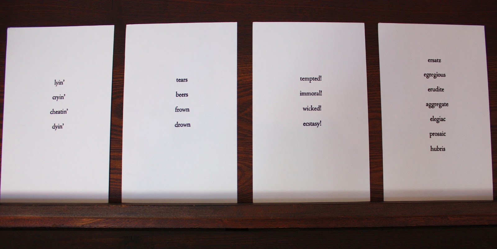
There is a mixture of the common and the treasured to the space and objects within Monastiraki; which is which being a matter of one’s perspective. As well, a space that is both public and private. I wanted to create a body of work that expressed duality, that talked with Monastiraki’s collection, and that spoke to the neighbourhood. I gleaned a series of words, synonymous in both French and English, and cut them in grey adhesive vinyl. These small texts are displayed throughout Monastiraki in subtle and bold placements, and with literal and abstract connotations. The selected synonyms are adjectives and nouns that look identical in both languages, but most often with different pronunciations. Whichever of the languages one chooses to read the word in is subjective, but the meaning the same. Perhaps illustrating how individual languages can interact together due to the proximity of cultures and, for this project, specifically the intertwined histories between France and England. Monastiraki itself sits on the psychic border between Montreal’s Francophone and Anglophone communities, and as its name suggests it is an Allophone space – a language and culture outside the dominant binaries of French and English. From this perspective there would seem to be more ambiguity than certainty when it comes to defining these boundaries.
----------------------
Communiqué de l’artiste en résidence de Monastiraki
ALLUSIONS
On trouve un mélange du commun et du précieux dans l’espace et les objets de Monastiraki, lequel regard qu’on y porte dépendant de la perspective de chacun. Il s’agit d’un espace qui est à la fois public et privé. J’ai voulu créer une œuvre qui exprime la dualité, qui renvoie à la collection de Monastiraki et qui rejoint le quartier. J’ai glané une série de mots, de synonymes en français et en anglais, et je les ai coupés dans un vinyle adhésif gris. Ces petits textes sont exposés à travers Monastiraki dans des lieux subtiles et audacieux, aux connotations à la fois littérales et abstraites. Ces synonymes sélectionnés sont des adjectifs et des noms qui semblent identiques dans les deux langues, mais qui, le plus souvent, possèdent des prononciations différentes. La langue dans laquelle chacun décide de lire ces mots est subjective, mais le sens reste le même. Ce projet illustre peut-être comment ces langues peuvent interagir ensemble due à la proximité des cultures et, plus spécifiquement, il illustre le rapport entre les histoires inextricablement liées de la France et de l’Angleterre. Monastiraki elle-même se situe à la frontière psychique entre les communautés francophones et anglophones de Montréal, et, comme son nom l’indique, il s’agit d’un espace allophone –une langue et une culture à l’extérieur des dominantes binaires du français et de l’anglais. Selon cette perspective, il semblerait y avoir plus d’ambigüité que de certitude lorsqu’il s’agit de définir ces frontières.
ALLUSIONS

Exposition: sept. 20 2013 – dec. 21 2013
Vernissage : sept 20 2013, 17:00-20:00
Monastiraki Residency artist’s statement
ALLUSIONS
There is a mixture of the common and the treasured to the space and objects within Monastiraki; which is which being a matter of one’s perspective. As well, a space that is both public and private. I wanted to create a body of work that expressed duality, that talked with Monastiraki’s collection, and that spoke to the neighbourhood. I gleaned a series of words, synonymous in both French and English, and cut them in grey adhesive vinyl. These small texts are displayed throughout Monastiraki in subtle and bold placements, and with literal and abstract connotations. The selected synonyms are adjectives and nouns that look identical in both languages, but most often with different pronunciations. Whichever of the languages one chooses to read the word in is subjective, but the meaning the same. Perhaps illustrating how individual languages can interact together due to the proximity of cultures and, for this project, specifically the intertwined histories between France and England. Monastiraki itself sits on the psychic border between Montreal’s Francophone and Anglophone communities, and as its name suggests it is an Allophone space – a language and culture outside the dominant binaries of French and English. From this perspective there would seem to be more ambiguity than certainty when it comes to defining these boundaries.
----------------------
Communiqué de l’artiste en résidence de Monastiraki
ALLUSIONS
On trouve un mélange du commun et du précieux dans l’espace et les objets de Monastiraki, lequel regard qu’on y porte dépendant de la perspective de chacun. Il s’agit d’un espace qui est à la fois public et privé. J’ai voulu créer une œuvre qui exprime la dualité, qui renvoie à la collection de Monastiraki et qui rejoint le quartier. J’ai glané une série de mots, de synonymes en français et en anglais, et je les ai coupés dans un vinyle adhésif gris. Ces petits textes sont exposés à travers Monastiraki dans des lieux subtiles et audacieux, aux connotations à la fois littérales et abstraites. Ces synonymes sélectionnés sont des adjectifs et des noms qui semblent identiques dans les deux langues, mais qui, le plus souvent, possèdent des prononciations différentes. La langue dans laquelle chacun décide de lire ces mots est subjective, mais le sens reste le même. Ce projet illustre peut-être comment ces langues peuvent interagir ensemble due à la proximité des cultures et, plus spécifiquement, il illustre le rapport entre les histoires inextricablement liées de la France et de l’Angleterre. Monastiraki elle-même se situe à la frontière psychique entre les communautés francophones et anglophones de Montréal, et, comme son nom l’indique, il s’agit d’un espace allophone –une langue et une culture à l’extérieur des dominantes binaires du français et de l’anglais. Selon cette perspective, il semblerait y avoir plus d’ambigüité que de certitude lorsqu’il s’agit de définir ces frontières.
Saturday, August 31, 2013
A New MONASTIRAKI Print !
Rebecca & Quentin of L'APPÂT designed and printed this wicked poster for Monastiraki, a riff on our famed Green Wall Of Chaos !


Friday, August 16, 2013
The Swimmer & The Rain Cloud
Our late summer window display boasts a papier maché / bricolage diorama
by Emilie O'Brien & Tara Slaughter.


by Emilie O'Brien & Tara Slaughter.


Monastiraki on MOCO Local
Designer Zoe Mowat gave us a shout out on her list of 5 fave places in MTL !

"MOCO LOCO is 10 years on the web this year, to mark the occasion this week we're talking to designers from where we began, our home town of Montreal. We asked designer Zoë Mowat for her five favourite places in Montreal right now"
MOCO local

"MOCO LOCO is 10 years on the web this year, to mark the occasion this week we're talking to designers from where we began, our home town of Montreal. We asked designer Zoë Mowat for her five favourite places in Montreal right now"
MOCO local
Wednesday, July 31, 2013


Sunday, July 14, 2013
HORAIRE JUILLET / JULY HOURS
Ouvert les weekends seulement ! AUSSI LUNDI !!!!
vendredi le 19 au lundi le 22
friday the 19th to monday the 22nd
vendredi le 26 au lundi le 29
friday the 26th to monday the 29th
merci & thanks
emilie & billy
MONASTIRAKI
Wednesday, July 10, 2013
Tara Slaughter Curatorial Projects @ Monastiraki
We here at Monastiraki have been thrilled to have Tara Slaughter acting as resident and guerrilla curator, going through our archives and collections and pulling together creative assemblages and whatnots, let alone helping us out with myriad matters at hand.
Below please find the projects Tara has been working on:
Below please find the projects Tara has been working on:
OLD + NEW
The first series of items include elements from the scrap
box, where two bits only cost a dollar. The thread, if you’re looking for one:
old meanings are neglected in hopes of constructing newer, increasingly foolish
ones.

Old and New
COMPLEMENTS OF THE SHOP
Dr. Yves Benoist is, indeed, the centerpiece for this week’s
curatorial project. The psychology publication, one that encourages the reader,
“Master your life,” supplied the complementary colour palate.

A Small But Nevertheless Significant Sample Of Dolls
A collection of lonely, lovely dolls accompanied by their shadows.

The Psychedelic Collection
The first completely archival project, this collection includes various paper ephemera of the psychedelic flavor.

Round & Blue
Own your sadness!
Hang it on the wall!
Show your blues who’s boss.

Tara Slaughter
Artist Statement
Most of my work reflects an interest in disjointed thoughts
and miscommunication. The pairing of text and images/objects lends itself to
the difficulties I have when it comes to bridging the gap between thought and
action, past and future. This gap can be a source of uneasiness or confusion. By
accompanying images with text, especially when their relationship to one
another is incoherent, I convey my inability to make sense of this break.
Bio
Born and raised in Great Falls, Montana, Tara Slaughter
moved to Montreal in 2013. In 2012 she spent a summer interning at the
Independent Publishing Resource Center in Portland, Oregon, where she was
immersed in zine culture and letterpress. This sparked an interest in DIY
culture.
At Monastiraki, a gallery/shop in Montreal, she engages in a
self-directed curatorial study – selecting and photographing collections from
the shop’s archives. These selections are then paired with short bits of text.
She is currently studying English literature at Concordia
University.
Friday, June 21, 2013

Thursday, June 13, 2013
PARTYKA!


Images from our current show - PARTYKA - a collective of 5 artists from Brooklyn. Our front vitrine is full of cut outs and hanging drawings by them....Check it out yo!
Thursday, May 23, 2013
Joe Ollmann & Lorenz Peter Double Book Launch June 1st !

We are please to host this Conundrum press double header of comic greatness ! Come out June First to hobnob with master cartoonists !
PARTYKA - BROOKLYN COMIC COLLECTIVE - JUNE 2013 !

We are super stoked to present 5 great cartoonists in our space for June 2013
PARTYKA : THE PAPER INFERNO
feat.
Shawn Cheng
John Mejias
Sean McCarthy
Sally Madden
Matt Wiegle
Partyka est un collectif d’art et de BD basé à New York et Philadelphie. Individuellement, ils sont bédéistes, peintres, artistes des arts imprimés tels les estampes et illustrateurs. Ensemble, ils publient des mini-BD et des fanzines et organisent des courses de karts façon “guérilla”. “The Paper Inferno” est une exposition d’oeuvres sur papier et un étalage en vitrine célébrant le 10ème anniversaire de Partyka.
Saturday, May 11, 2013
Lonely Planet - there we are!
We have recently been visited by people from Australia, The Netherlands and England, who said they found their way to us because of the Lonely Planet. We were mystified - having had no idea that we had been spotted and entered into this well-loved list of places to see on our planet.
After some research we found ourselves, in the 2012 edition Montreal & Quebec. Although they strangely left out one half of our partnership in their otherwise excellent write-up - we were incredibly happy see that there we are! in the Lonely Planet! We even made it into the Top 5 places to see in the neighbourhood:

After some research we found ourselves, in the 2012 edition Montreal & Quebec. Although they strangely left out one half of our partnership in their otherwise excellent write-up - we were incredibly happy see that there we are! in the Lonely Planet! We even made it into the Top 5 places to see in the neighbourhood:

Thursday, May 02, 2013
Jason Urban - Letterforms

10 mai - 2 juin 2013
Vernissage vendredi 10 mai 18h - 21h
Letterform, une série d’estampes faites à la main, examine la typographie comme image, bruit et objet utilitaire. En simplifiant la typographie des lettres de l’alphabet Romain en de simples motifs qui unissent les figures et le fond, je minimise le pouvoir de communication de ces caractères de l’alphabet. Ces lettres/images sont faites de motifs linéaires imprimés et gravés avec soin. J’ai un appétit sans borne pour la répétition et ma recherche en création se concentre souvent sur le développement de systèmes exigeant un travail méticuleux et monotone. Cette inclinaison et intérêt pour le travail de main d’oeuvre m’a mené à embrasser l’imprimerie dans mon œuvre de création : l’essence même du travail répétitif et obsessif compulsif. Je commets ces actes physiques banals - ad infinitum- et à travers ces répétitions, ces gestes banals remplacent et contiennent le « sublime ».
À travers une fabrication en série de motifs linéaires vibrants et colorés, les estampes sont transformées en objets utiles : livres, sacs, et décorations sur les murs d’exposition à l’avant du magasin Monastiraki. Les bruit enlevants et vibrants qu’on y trouve évoquent du même coup le repos de la nature et la clameur d’un flux RSS sans fin.
http://www.jasonurban.com/
***
Jason Urban - Letterform
May 10 - June 2, 2013
Opening Friday May 10th 6pm - 9pm
Letterform, a series of hand-carved relief prints, investigates typography as image, noise and the utilitarian object. By reducing letterforms from the Roman alphabet into simple patterns that merge figure and ground, I minimize their communicative power. These letter/images are made of carefully carved and printed linear patterns. I have an endless appetite for repetition and my creative research often focuses on developing systems that require meticulous and monotonous labor.. This inclination and interest in physical labor has led my work to embrace printmaking: the very essence of repetitive, obsessive-compulsive work. I commit these mundane physical acts- ad infinitum- and through repetition the banal gestures become a stand-in for the "sublime."
Through mass-produced quantities of vibrating linear pattern and color, relief prints are transformed into objects of utility: books, bags and decorative wall art within Monastiraki’s storefront space. The vibrant red-hot noise simultaneously evokes the repose of nature and the clamor of an endless RSS feed.
http://www.jasonurban.com/
Wednesday, April 24, 2013
The Psychedelic Collection

Tara Slaughter chose some items from Monastiraki's extensive psychedelic art collection
Thursday, April 18, 2013
April 2013 in the store
Here we are in the spring, we hope! Having come through yet another Montreal winter instills a deep longing for warm breeze and open windows, and green plants.
Some shots from our store as we head into this new season....
(and keep your eyes out for our new online print gallery coming soon, that will showcase some of the great prints we carry)


Some shots from our store as we head into this new season....
(and keep your eyes out for our new online print gallery coming soon, that will showcase some of the great prints we carry)
 |
| 'happy sleepy' dolls by marc and magda |
 |
| Letterpress coasters by Rose Pink |
 |
| Lightbulb print by Jacob Rolfe |
 |
| our amazing print drawers, filled with wonders upon wonders |


 |
| graph zines! |
 |
| our formidable small press corner |
Thursday, April 04, 2013
Mark Laliberte “Cut Program”
Mark Laliberte “Cut Program”
Collage Experiments, 2000-2013
Collage is a gesture that applies pressure to today's culture. By taking the formal images of the mainstream world and cutting into them, new versions of possibility take shape. Collage makes tomorrow possible now.
This exhibition offers a 'collage view' of several different collage projects I have created over the years, providing a sutured sampling of paper-based works spanning back to 2000. Whether chaotic, structured, messy or formal, the visual vocabularies on display here offer a surface look at the varied approaches taken in the struggle to organize meaning in a cut/paste world view.
bio/ MARK LALIBERTE is a visual artist, writer, curator, designer and soundmaker with an MFA from the University of Guelph. He has exhibited and performed extensively in galleries and festivals across Canada and the USA; he is the managing editor and designer of CAROUSEL. In April he will be: exhibiting at Monastiraki in Montreal; contributing works to 2 art auctions in Toronto; completing a new artist book, Angry Black Bang; participating in 'Nomadic Noise Residency', the start of a 4-month collaborative project in the wilds of Toronto. More info at: marklaliberte.com
Apr 11 – May 05, 2013
Opening Thu Apr 11, 18hr-21hr
---
L’exposition Collage est un geste qui applique les pressions de la culture d’aujourd’hui. En prenant des images officielles du monde courant et populaire, de nouvelles options possibles prennent formes. Collage amène une demain possible dans l’aujourd’hui, dans le présent. Cette exposition offre une « perspective collage » de plusieurs différents projets de collage que j’ai créés au fil des ans. Il fournit un échantillon remarquable d’oeuvres sur papier datant de l’année 2000. Qu’ils soient chaos, structure, brouillon ou officiel, ces vocabulaires visuels exposés ici offrent un aperçu des approches diverses utilisées dans la lutte pour catégoriser le sens dans un monde de « couper/coller ».
Mark Laliberte est un artiste en arts visuels, un écrivain, un curateur, un designer et un professionnel du son qui a obtenu un MFA de l’Université de Guelph. Il a exposé et performé à plusieurs occasions dans des galeries et festivals à travers le Canada et les États-Unis. Il est éditeur et designer de Carousel. En avril il : exposera à Monastiraki, contribuera ses œuvres à deux enchères de Toronto, complètera son nouveau livre d’artiste, Angry Black Bang,participera à Nomadic Noise Residency, un projet de collaboration ayant lieu dans la nature de Toronto. Plus d’infos à : marklaliberte.com
11 avril - 5 mai, 2013
vernissage jeudi, 11 avril, 18hr-21hr

Tuesday, March 26, 2013


Subscribe to:
Posts (Atom)